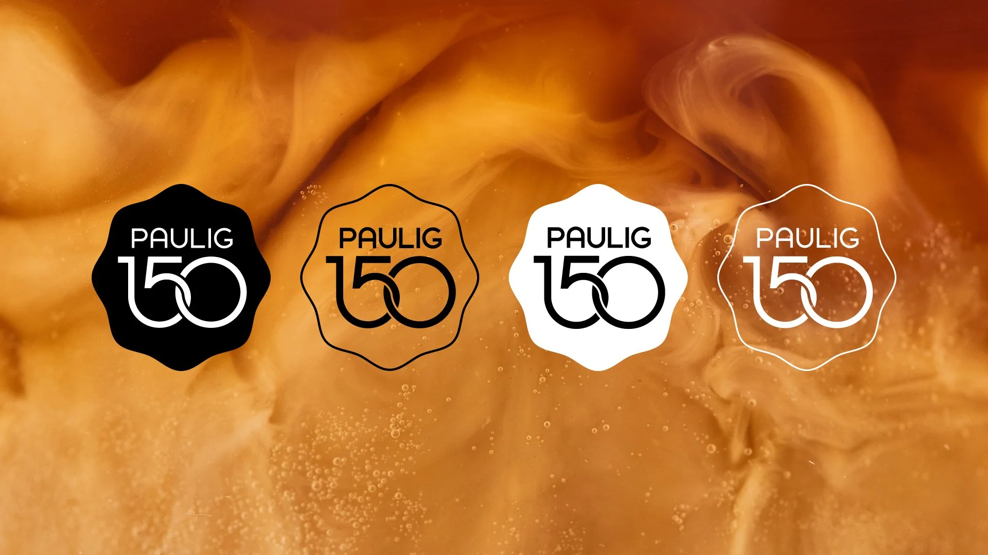
Paulig 150th Anniversary Emblem
Celebrating Paulig 150th year
Purpose
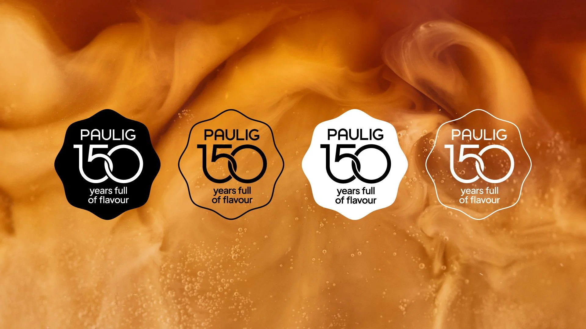
The Paulig 150th Anniversary Emblem is a celebratory mark that links all anniversary-year activities together.
Team
Tomi Salo - Designer & Junior Art Director
Riikka Rechardt - Senior Copywriter
Jon Gustavson - Senior Art Director
Anu Igoni - Executive Creative Director
Jenny Lundqvist - Project Manager
Sebastian Örn - Client Lead
Design language and solutions:
The background shape evokes a wax seal or hand-pressed stamp adding a sense of celebration and craftsmanship, where softness meets a sense of legacy.
The numbers form a visually coherent whole, where the stroke of the 1 flows naturally into the 5 while the 0 wraps around and connects with it, conveying continuity and movement – the symbolism fits well with the 150-year development curve. The shapes of the numbers have been designed to be consistent with the shapes of the letters in the Paulig corporate brand logo.
The emblem works well in both print and digital environments, and it remains recognizable even at a small size. The visual language pays homage to Paulig’s long history in a modern and simple way without any nostalgic clichés.
My role
I led the emblem design end-to-end — from concept and final artwork to creating a comprehensive usage guide.
NoA | Bob the Robot
Application
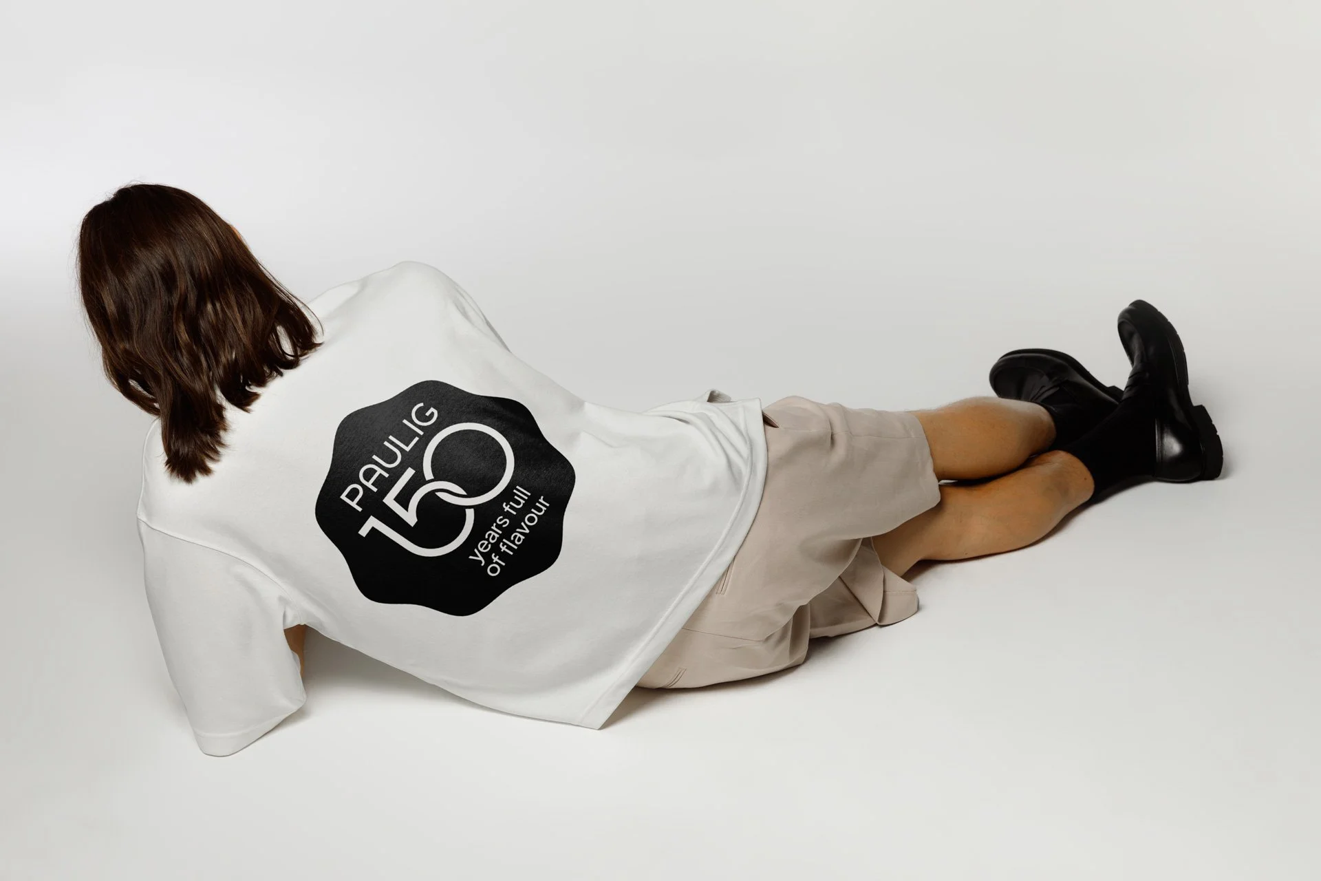
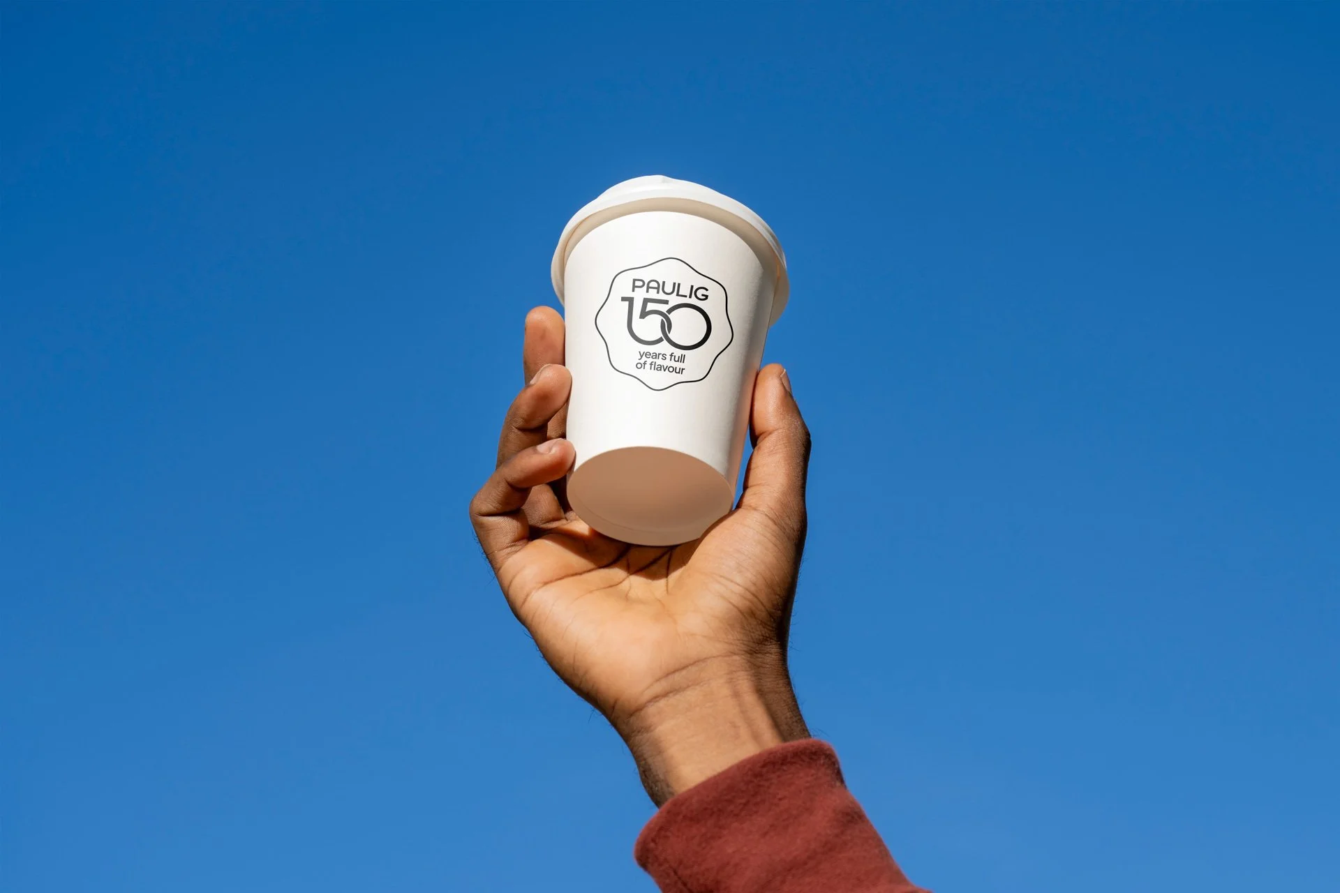
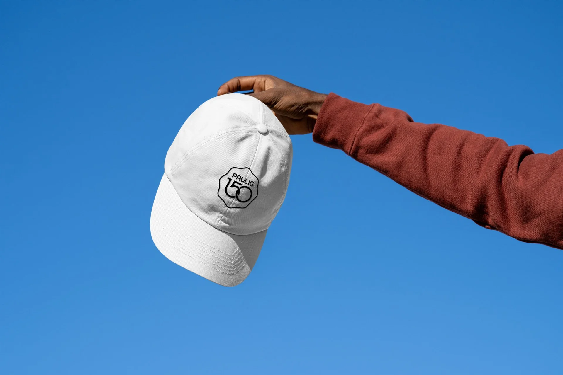
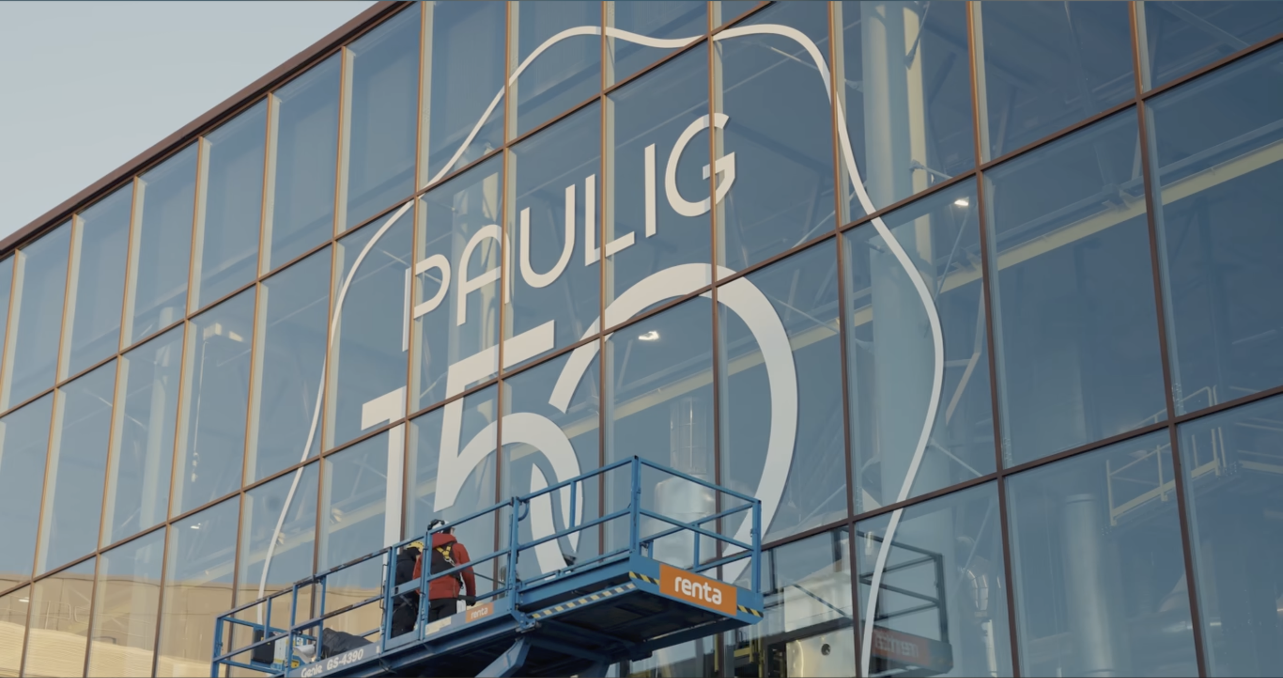
The emblem became a central part of Paulig’s 150th anniversary identity, appearing across packaging, social media, film, office environments, factory windows and virtually all anniversary communications throughout the year.